Shift to touch-screen
The iPhone revolutionized touch-screens in 2007. Apple was visionary; everybody else is just catching up. What do we have so far?
All market players, including large phone makers such as Nokia, Samsung and HTC, and large online service providers such as Google, Microsoft and Research In Motion, have released touch-screen phones. Some phones are monolithic, having a touch surface only, while others are transformers, having sliders with a separate physical keyboard. All products are still single-side touchable, which is predefined by hardware design.
New approaches have emerged, teasing us. Windows Phone 7 uses bounce and wave effects to dynamically show the pieces of invisible content. It also truncates content to tease you statically, driving you to take actions to see that content.
Could you avoid a touch shift in mobility? No, it has happened already. Is it good? Yes, although it may be problematic for some users (such as seniors), and this must be considered by UX designers. The transition from non-touch to touch phones might have a more gradual learning curve, so the efficiency and effectiveness of new phones could be under greater scrutiny.
Default mobile screens are yucky
You might be surprised by such a statement, but user experience has found this out. Other issues are related to the speed of making a mental choice. Another is related to the physical selection after the mental choice is made.
The more alternatives we have, the more time we need to make a mental choice. When it comes to mobile phones, Hick’s Law is in effect: The more icons we see on the screen, the more time we need to think over what we are doing. There’s also Fitt’s Law: The smaller the item is, the more time it takes to actually touch it. And the longer the distance to the item, the more time it takes to reach over and touch it.
Those effects are most pronounced the first time with the phone, but after a while, users get used to where things are.
The situation with default screens is interesting. iPhone and fifth-generation Symbian devices have average conformance to those laws. Windows Phone 7 has better conformance, while Google’s Nexus One seems to be a UX failure and is likely to be updated with a new model. But the Windows Phone 7 screen has not been optimized for high-information resolution, so it will need to be updated as well.
QWERTY is alive
The piano-style keyboard layout was introduced in 1867, but it only seemed to cause jams in typewriters. In 1878, the QWERTY keyboard was introduced, followed by the Dvorak layout in 1936, which some say makes typing even faster.
In 2010, for both physical and electronic keys, we still have QWERTY.
The manner of typing has changed on mobile phones. We type with several fingers or a stylus instead of our hands, like on a full-sized keyboard. Therefore, we must find a more efficient way to facilitate human-device interaction. The Dvorak layout may not be sufficient for this. It may take something brand new.
Precious space is wasted
“Above all else, show the data.” Edward Tufte, 1983.
This principle has become critical to mobile application usability. Mobile devices are characterized by their small screen size. This means that visual representation of data is much more important than for desktop computers.
Observation and analysis shows that even iconic products have flaws. This link contains an iPhone review by Edward Tufte, renowned master of the information representation. There are issues with toolbars and status bars that waste 10% of the screen, thick borders between items that make the items smaller, and so on.
There is a valuable argument as to why the standard iPhone weather application displays information inefficiently. The user is forced to do a lot of scrolling, the amount of information is small and its usefulness is questionable. The table below shows the comparison of inefficient (left) vs. efficient (right) data representation.
iPhone Standard Weather App Another Phone Weather App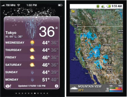
The same mobile screen can show more useful data by improving the data-ink ratio, and by applying active UX design. The “efficient” snapshot shows significantly larger amounts of information without overwhelming the user. It could contain a seven-day forecast for even better value.
The second important aspect of the correct snapshot is active UX; the application instantly shows information without the user needing to navigate through it.
Can mobile screens carry such rich information? Yes. Can users consume such rich information? Yes, because the human eye transmits data at the rate of 10 million bits per second! Poor word visualization is several kilobytes per second. Hence, 10,000x improvement is possible in visualization.
Mobile vendors use different approaches to screen-space utilization. Windows Phone 7 comes with extra clicks on its standard applications (like Picture Gallery), where instead of viewing picture space, you have to click on a menu on an extra screen. Microsoft’s use of deep hierarchies might originate from its desktop Windows era. The iPhone does not have that administrative debris and is considered easier to use.
Rich Internet applications change the game
Mobile RIA is the next big thing: It’s both an opportunity and a significant problem. For example, there are platform compatibility issues to overcome. Microsoft-to-Microsoft compatibility was always good and was one of Microsoft’s strengths. Now, the old, orphaned Windows Mobile 6.5 is not compatible with the newly introduced Windows Phone 7 because of new development models based on Silverlight and XNA.
Another example is Adobe’s struggle to put Flash onto the iPhone. Flash on the iPhone is impossible now, officially speaking. Flash for the iPhone is abandoned, as Mike Chambers, Flash’s product manager, said on his blog.
Mobile RIA wars will continue. HTML5 is coming to all front ends, as is JavaFX and other new mobile platforms, like Samsung bada and Intel-Nokia MeeGo.
Mobile RIA wars will definitely continue, which means multiple technologies, different standards, and no “one size fits all” solution for mobile development. This is a good forecast for software makers.
Vasyl Mylko is the Research & Development Director at SoftServe.


