If you are building a SharePoint site, whether it’s for an internal intranet portal or a public-facing Internet site, chances are you will need to support different types of mobile devices. SharePoint 2013 includes an interesting feature called Device Channels (included when Publishing is activated on a site collection) that can help tailor your SharePoint UI to specific devices. To accomplish this task, Device Channels use partial string matching in the device’s browser User Agent to display different information to users based on their device.
To try out Device Channels, you have to first create one. From a Publishing site, click Site Actions > Site Settings and then navigate to Device Channels (you can also manage Device Channels from inside the new Design Manager menu). From there, you can either edit or create Device Channels, so click Create a Channel. From here you can assign a few settings:
• Name – This will be how the Device Channel is referenced in the SharePoint UI when site owners are applying master pages.
• Alias – This will be how the Device Channel is referenced behind the scenes in code.
• Description – A brief description shown in the SharePoint UI.
• Device Inclusion Rules – This is where you enter User-Agent substrings for devices. Enter part of a browser User-Agent string and, based on the order of the Device Channels, whichever one matches the string first will be the Device Channel that is applied for a given browser.
• Active – Allows you to turn Device Channels on and off. This will control whether the Device Channel shows in the SharePoint UI or not.
For this test, you can make a device channel that targets a particular browser like Chrome. Enter “Chrome” for the Name, Alias and Device Inclusion Rules (the word Chrome is in the User Agent for the browser), then click the checkbox for Active and click Save. Now that you have a Device Channel created, an easy way to see it in action is to apply a different master page to that channel. Click Site Settings > Master Page and you will now see a new option under Site Master Page for Chrome:
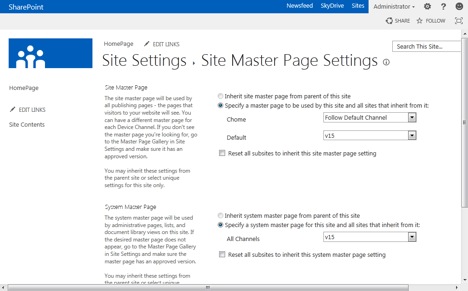
By default, your new Device Channel is set to Follow Default Channel, which means it will just show the same master page as everything else. To see it in action, you can apply another master page for the Chrome channel. If you don’t have a custom master page (and why the heck not!? You can go create one easily with the Design Manager now. I’ll wait…), you can apply the Oslo master page for this test. It’s very similar to the default master page, but it hides the Quick Launch navigation.
Once you have applied Oslo for Chrome, leave Default set to v15 and click OK. Now, if you browse back to the home page (or any page that doesn’t use the System Master Page), you will see a different master page for Chrome than you will in any other browser.
This was a pretty simple test, but I think you could imagine the possibilities. For example, you could have specific master pages targeted to Android, iOS or Surface tablets that tailor the UI for each device.
Device Channels can also be used in other ways besides User-Agent strings and master pages. Here are a few:
• Custom code – Aspects of the UI can be changed based on custom code conditions
• Cookie – A Device Channel cookie can be set that switches the UI automatically based on the value of the cookie
• Device Channel Panel – Specific parts of a master page or page layout can behave differently based on a Device Channel through the use of <Publishing:DeviceChannelPanel>, which can specify one or more IncludedChannels for SharePoint to look for.
• URL Parameters – You can pass a URL query string of DeviceChannel=Desired_Channel_Alias to a page, and it will behave as though that page was visited by the specified device. This can be helpful for testing specific Device Channels if you don’t have the device in question.
That’s about it for Device Channels. Hopefully you find them useful when creating SharePoint sites that adapt to various browser types. For bonus points, feel free to use Device Channels along with CSS3 Media Queries to target device feature attributes (like height, width, resolution and orientation) to change CSS styles also!
Randy Drisgill is a SharePoint MVP, and the branding and design lead consultant at SharePoint911, a Rackspace company.


