Data is overwhelming cybersecurity teams worldwide. Too much data is not necessarily a bad thing, but the daily barrage creates challenges stemming from the following questions: where is the data coming from, what does it mean and how can it be applied to keep companies more secure? Many in security operations are grappling with how to best answer these questions and there are various tools and approaches available.
However, as I evaluate these approaches, I’ve come to realize that security operations tools are lacking in three main aspects of product development embraced by the rest of the tech industry: visualization, design, and usability. It is these elements that most impact how security teams interact with data on a daily basis, and the user’s ability to digest the data is ultimately the true measure of success. Here are some of the things we learned from our exploration in designing contextual data visualizations and a modern and fast user interface for cyber security operations.
Reduce complexity at all levels
Manually reviewing security alerts to extract intelligence from noisy data can be a mundane task. Most security teams rely on information gathered from multiple security appliances, which further amplifies the noise. This makes the task of understanding such data a slow and painful process and ends up leaving companies vulnerable for an extended period of time.
From cave paintings to the written language, visualizing information to make it more expressive and consumable has been the oldest form of communication. However, merely visualizing data that is inherently complex results in a complicated visualization and the process of understanding such a visual remains slow. For cybersecurity operations, in which time is of the essence, a slow process does not work. So the first step in making such data consumable is to reduce the complexity of data. At my current company, we do this by converting ingested data into a graph-based interconnected data structure that emphasizes relationships and context between different artifacts of potentially malicious activity over time. Complexion reduction at the data level is a necessary step for preparing that data for consumption.
Use abstract visualization for summarizing information
Abstract visualizations are meant to show big picture analytics by summarizing all datasets over extended periods of time with high-level, quantitative metrics. Here is an example of a graph visualization of a large dataset:
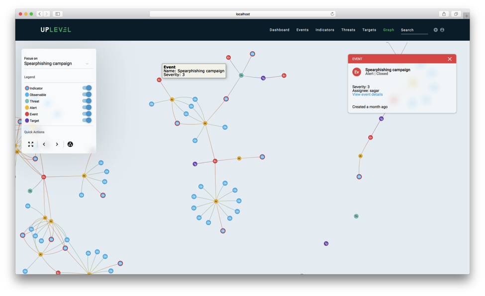
The important thing to note here is that while the actual data structure contains 601 nodes and 1179 relationships, the visualization in the picture contains only about 140 nodes and 139 edges (including nodes not in view). As a first step, we simplify the graph to maximize discernibility by removing a lot of information that is generally required for computing intelligence but is often extraneous to analysts.
This makes querying the graph visually much easier. The resulting, simplified data structure minimally summarizes graph connectivity and sophistication of attacks over time and provides users with the ability to identify and dive into specific malicious artifacts to remediate them.
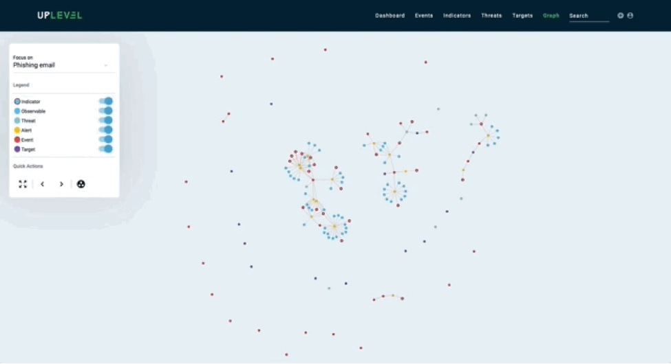
Here is another example of summarizing data based on a specific time frame:
Use actionable visualizations to encourage discovery
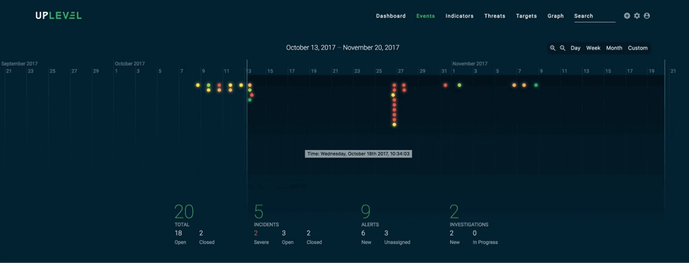
Actionable visualizations break down data in a detailed manner so it can be acted on quickly by users. These visualizations encourage discovery by demanding interactions and producing insights. Below is an example of an artifact tree which is a relevant subgraph from the overall graph structure. The tree visualization mimics a file system hierarchy to keep interactions familiar.
Emphasize context
Just because something can be visualized doesn’t mean it should be. Visualization is most effective when it’s used to put data into context, rather than trying to visualize all available data. For example, if a security analyst is working on resolving an incident he or she only cares about data related to the task at hand. This data should be easily accessible without having to sift through all data to find the relevant details every time they need to be accessed.
A reductionist approach to data visualization paves the way to adopting context-aware interfaces, which is based on context-sensitive design used to reduce complexity. Instead of trying to compress all data into a single visualization, try to determine the context surrounding a data point and selectively make it the focus of attention.
The first step in designing a context-sensitive UI is to define the context. Some steps we follow for defining our context include:
1) computing context trees for each security alert at the time of data ingestion, and
2) measuring and learning from what analysts are working on at the time of interaction.
The second step can, and should, involve both qualitative as well as quantitative research on the usability of an existing UI.
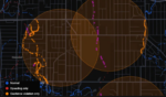
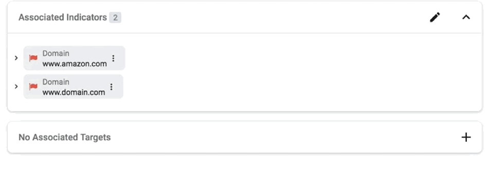
Identifying context can often be used to highlight insights that users might find helpful. For example, in the following visual, we show users where each attack target was last seen.
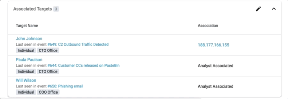
And knowing the context can also help you dynamically prioritize the presentation of information to analysts.


Here the artifacts associated with an incident are smartly populated depending on a dynamic precedence order of importance. For the incident “Phishing Email” above, an associated indicator is of more relevance than other types of relationships, whereas for “FireEye Ex Malware Alert” the associated threat is more relevant.
Less is truly more
Designing an interface is a process that never ends. The key is to find decision-making trigger points and strike a balance in giving the right amount of summary and the right amount of details, while collecting user feedback and refining this process.