There were MP3 players, and then there was the iPod. There were cell phones, and then there was the iPhone. There were tablet PCs, and then there was the iPad. The Apple Watch, arriving later this month, has some pretty tough acts to follow.
At the risk of sounding like a copywriter, Apple’s consumer products have a track record of redefining their niches. Prior to the iPod, MP3 players were the ugly descendants of the cheap CD players that were the ugly descendants of the commodity cassette players that replaced the once-revolutionary Sony Walkman. Like the original Walkman, one didn’t “listen” to an iPod, one “wore” an iPod and made a fashion statement thereby.
There is a wonderful image of what phones looked like before and after the iPhone that captures how utterly transformative the black glass slab was. It’s only now, with the battle conceded as a race toward minimalism, that Android’s Material Design gives that platform a claim to design leadership.
The iPad, in contrast, didn’t redefine a niche, it created one. Yes, I know all too well that Microsoft shipped a Tablet PC operating system in 2003, having made an expensive multiyear gamble on mastering its APIs. But it was, by 2010, a barely perceptible vertical LOB niche. Now, somewhere in excess of 200 million iPads have been sold. Not bad.
With all of Apple’s consumer products, the importance (maybe primacy) of the physical design is hard to overstate. The iPod’s click-wheel, the lack of buttons on the iPhone, the “one pointer: your finger” design of the iPad: These were not incidental to the product’s success. With the Apple Watch, the most prominent aspects are the size (38mm and 42mm) and the “digital crown,” which is the primary way of scrolling and, when pressed, acts like the “Home” button of iOS devices.
I have not yet held an Apple Watch, but I have spent much of my time in the past few months programming for it. The first reaction to the Apple Watch SDK is “Geez, this is limited.” The second reaction is “Geez, this is going to be hard to design for.”
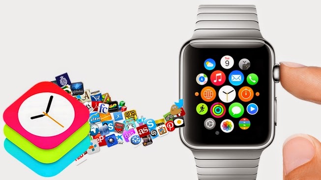
In this first version, apps written for the Apple Watch actually execute on a connected iPhone, not on the watch hardware itself. No iPhone, no program, so put aside that “exercise app” idea.
This is slated to change “later in 2015,” which seems to imply that the first-generation hardware will be able to support on-watch apps, but the restriction clearly relates to power consumption. The hardware will evolve and software updates should be able to eek out better performance, but recharging is one of those areas where a smartwatch will inevitably disappoint compared to a traditional watch.
Developers have no access to the hardware sensors on the Apple Watch. The common disappointment here is that devs cannot access the heart rate monitor (seriously, put aside that “exercise app” idea). Less frequently asked for, but perhaps even more disappointing: Devs cannot access the watch’s motion processor and so cannot track gestures or make a calculation based on the user pointing at something (such as a star, distant mountain, or vaguely familiar person sitting at the bar).
Because the Apple Watch is essentially an external display for a program running on a connected iPhone, the user interface is far less flexible than iOS devs are used to. There is no Core Image layer for custom drawing, there is no touch location (so no non-rectangular buttons), and the pixel dimensions of the screen are sobering (272×340 and 312×390). With such tight dimensions, design concepts tend toward pseudo-3D layers, but these are difficult to produce statically and, if rendered dynamically on the connected iPhone and uploaded, are undoubtedly going to have performance and power issues.
Meanwhile, the limited number of options that can be displayed on a single screen tends to create off-putting interaction design. For instance, one of the apps I’ve worked on is intended for use by whale watchers, and can require up to six screens to record all the available parameters. It’s going to require a lot of user testing to evolve that into an enjoyable user experience.
The upside of these limitations is that the actual programming of a Watch app is pretty darn easy for iOS devs; the hardest thing is understanding the connected-iPhone architecture. The downside is that design is pretty darn brutal.
A recent New Yorker profile of Jony Ive explores the unforgiving importance of detail and iteration in the industrial design of Apple products. Time and again this is held out as what distinguishes Apple from the competition. Those developing watch apps had best embrace the lesson.
It’s Jony Ive’s watch, we just live in it.