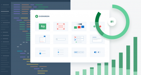
Segment, the developers of this week’s highlighted open-source project Evergreen, had a core set of beliefs in mind when they set out to design their robust framework of flexible and enterprise-ready React components. According to the project’s GitHub:
- “Evergreen is built on the belief that you can never predict all future requirements, only prepare for it. Instead of creating fixed configurations that work today, Evergreen promotes building systems that anticipate new and changing design requirements.
- Evergreen is built on the belief that things should work out of the box with smart defaults, but also offer full control when needed. For example, Evergreen uses CSS-in-JS and builds on top of the Box component in ui-box.
- Evergreen is built on the belief that using Evergreen and contributing to Evergreen should be a pleasant experience. We prioritize documentation and all the tools for a solid developer experience. We advocate respect and inclusivity in our writings and interactions.”
Jeroen Ransijn, product designer at Segment, laid out in a blog post the value of having an intuitive design system at your disposal as a web developer. After numerous prototypes over the course of two years at Segment, Ransijn said that he found it absolutely necessary to streamline some of the design processes.
“The prototypes I wanted to develop would live outside of our Segment application and would have no access to the application codebase,” Ransijn wrote. “This means that I didn’t have access to the components already in the application — I had to create everything from scratch. Most advice online talks about starting with a UI audit or trying to get executive buy-in. Those are all part of the long journey of a design system, but there are many ways to get started. If you set out to solve all of the problems in your product, you might be taking on too much at once. Instead, build something small and useful, provide value quickly, and iterate on what works.”
Ransijn explained that Segment chose React when designing Evergreen because the company already used the popular JavaScript library in its daily operations. By starting from the React UI Primitive level, that the Evergreen team was able to design UI-BOX, which exports a single React Box component “that allows you to use React props for CSS properties,” according to Ransijn.
Though altering CSS styling in Evergreen is still “complex,” according to Segment, a new branch allows developers to tool around with it.
“It is important to note that UI-BOX only solves some of the problems,” Ransijn wrote in the post. “A class is still needed to control the appearance of a component. For example, a button can add dimensions and spacing with UI-BOX, but a class defines the appearance: background color, box shadows, color as well as the hover, active and focus states.”
But Ransijn said the Segment team has gotten a lot of use out of the streamlined styling that Evergreen provides.


