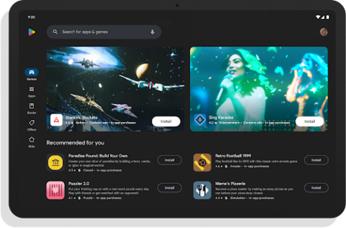
Google is launching new features to make it easier for app developers to better display their app in the Play Store.
“The assets and information you provide – descriptions, images, and videos – are essential to users looking to make a decision on what to download,” Allison Chang, product manager for Google Play; Weifang Sun, product manager for Chrome OS; Manuel Wang, product manager for Google Play Console; and Marcus Leal, product manager for Google Play, wrote in a blog post.
Starting next year, Google will give apps that follow its content quality guidelines for larger screens access to richer formats, which will allow them to change the way an app is displayed in the Play Store.
The team is also adding support for Chromebook-specific screenshots in the Play Store. Currently, when a Chromebook user browses the store, they will be shown screenshots from phones or tablets, which may be different from how the app looks on a Chromebook. Up to eight screenshots will be able to be uploaded, according to Google.
The company is also updating the quality guidelines for tablet screenshots so that developers can provide consistency across larger screens. This will give developers a simpler process for generating new screenshots when an app is updated.
According to Google, these updates will make app listings much more prominent, so they also shared some best practices for optimizing Play Store images, which include:
- Using device-specific screenshots to demonstrate the core app experience
- Being careful not to show a physical device in images because it may become obsolete or alienate users
- Using high-quality images with the correct aspect ratio and resolution
- Avoiding overloading photos with text
“As we continue to test ways to feature your store listing information more prominently in Play, the quality of your assets remain as important as ever. We hope these features and tips empower you to showcase the best of your app on all device types,” the team wrote.


